Project 1 - MTA Subway Data

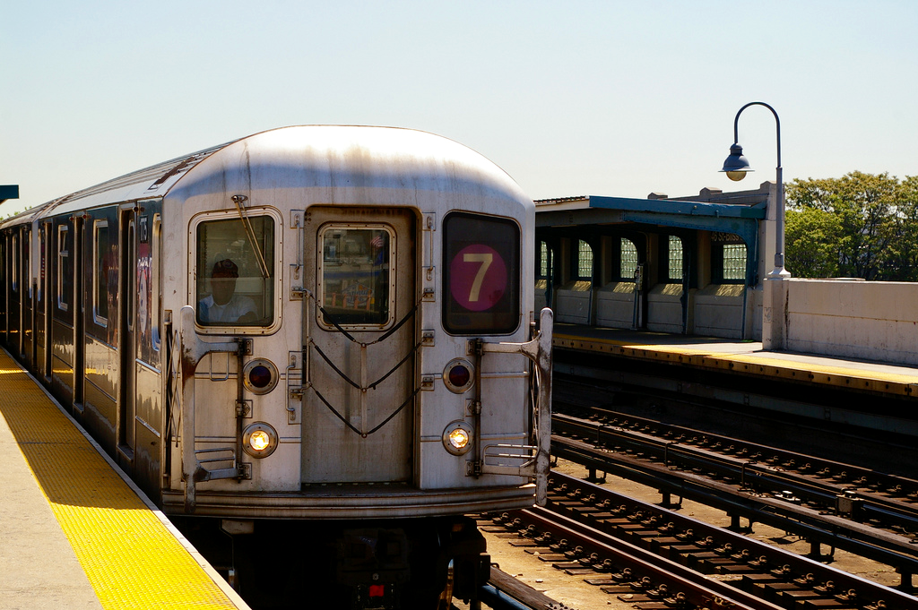
Photo via Flickr Creative Commons/Bryan Pocius
The Project
The goal for the first project at Metis was to help WomenTechWomenYes (WTWY), a fictitious New York City (NYC) organization, devise a strategy to build public awareness about their organization and mission. As consultants, Alex, my partner, and I made recommendations on locations to place WTWY street teams at entrances to subway stations, so that their teams could engage with people who would attend their gala and donate to their organization (our presentation).
Our Strategy
Keeping in mind that WTWY had limited resources and a tight schedule, our strategy was to optimize the number of interactions with individuals who would identify closely with the WTWY’s mission and be more likely to contribute to WTWY’s cause. We pinpointed areas with high concentrations of women and individuals in the tech industry, who would be most likely to be interested in WTWY’s mission.
Besides looking at foot traffic at MTA stations using the New York MTA subway data to make our recommendations, we also incorporated NYC census information and the locations of tech hubs. Tech hubs, such as Chelsea, SoHo, the Flatiron District, the Financial District, and Dumbo, are areas with a high number of tech companies, start ups, and bootcamps. We recommended 7 high foot traffic subway stations, with at least 1 station in each of the tech hubs to increase the chances that street teams would interact with different people. We also recommended 9 subway stations in 7 residential areas with higher numbers of women and people employed in scientific and technical industries compared to the NYC average.
Fun Findings
Here are a few fun things we found while exploring the data:
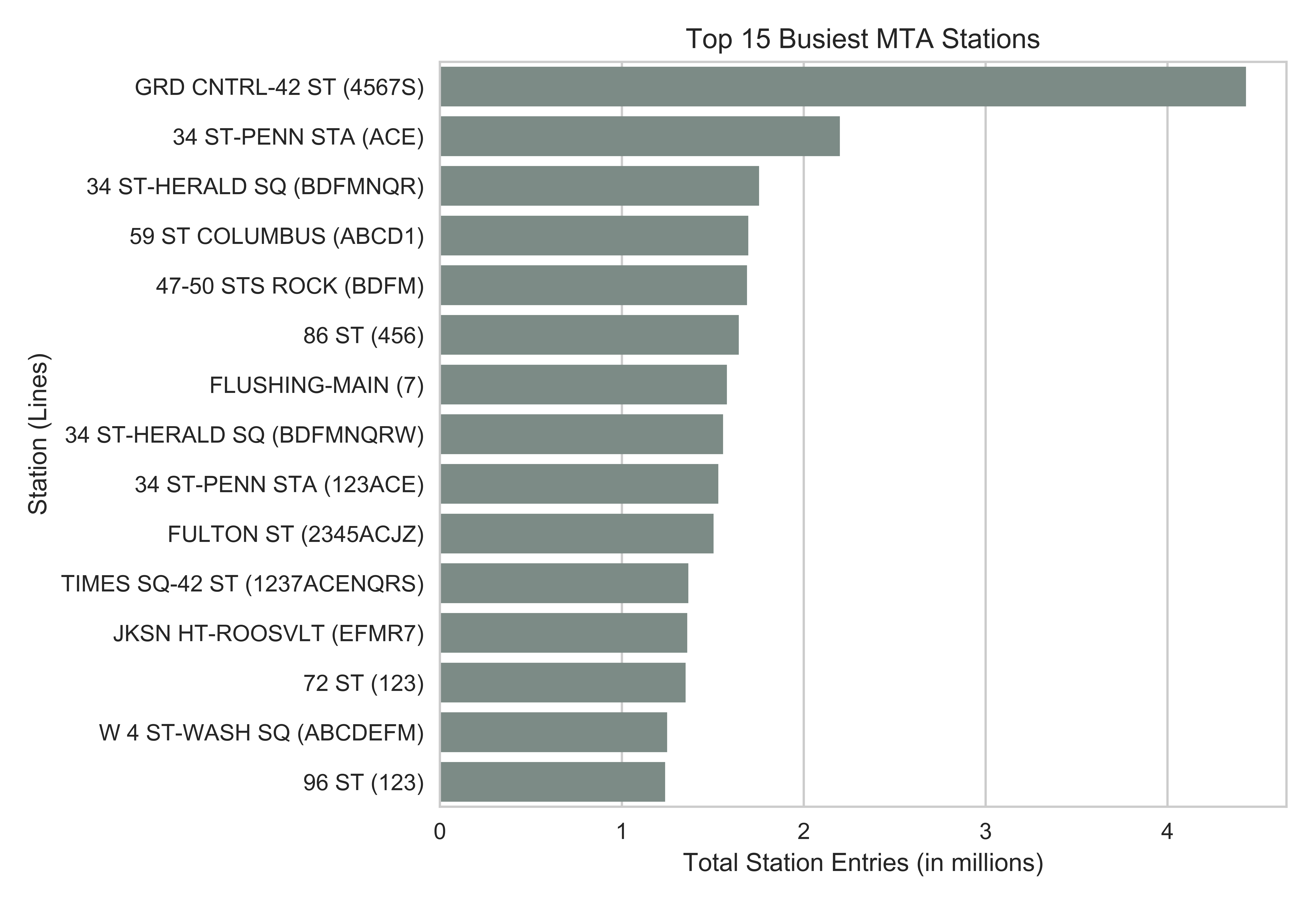
Between 8 am to 10 pm, the Grand Central - 42nd St Station was by far the busiest subway station. The top 2 busiest stations (Grand Central - 42nd St Station and 34th St - Penn Station) are close to busy bus, rail, and commuter transit terminals.

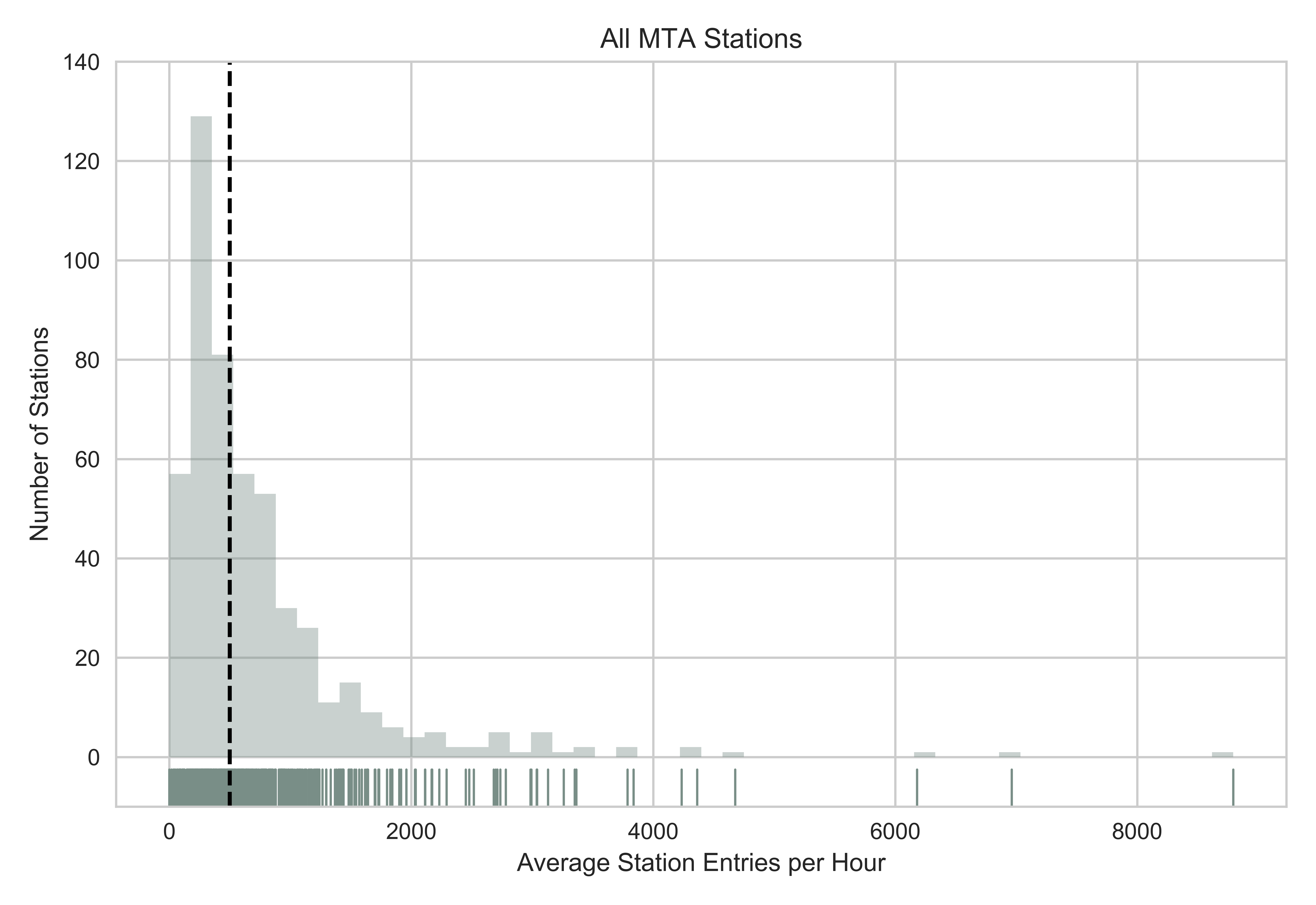
Half of all the subway stations have over 500 people entering the station per hour. The black line indicates the median. The distribution of foot traffic at MTA stations was very skewed, with a small number of stations experiencing very high foot traffic.

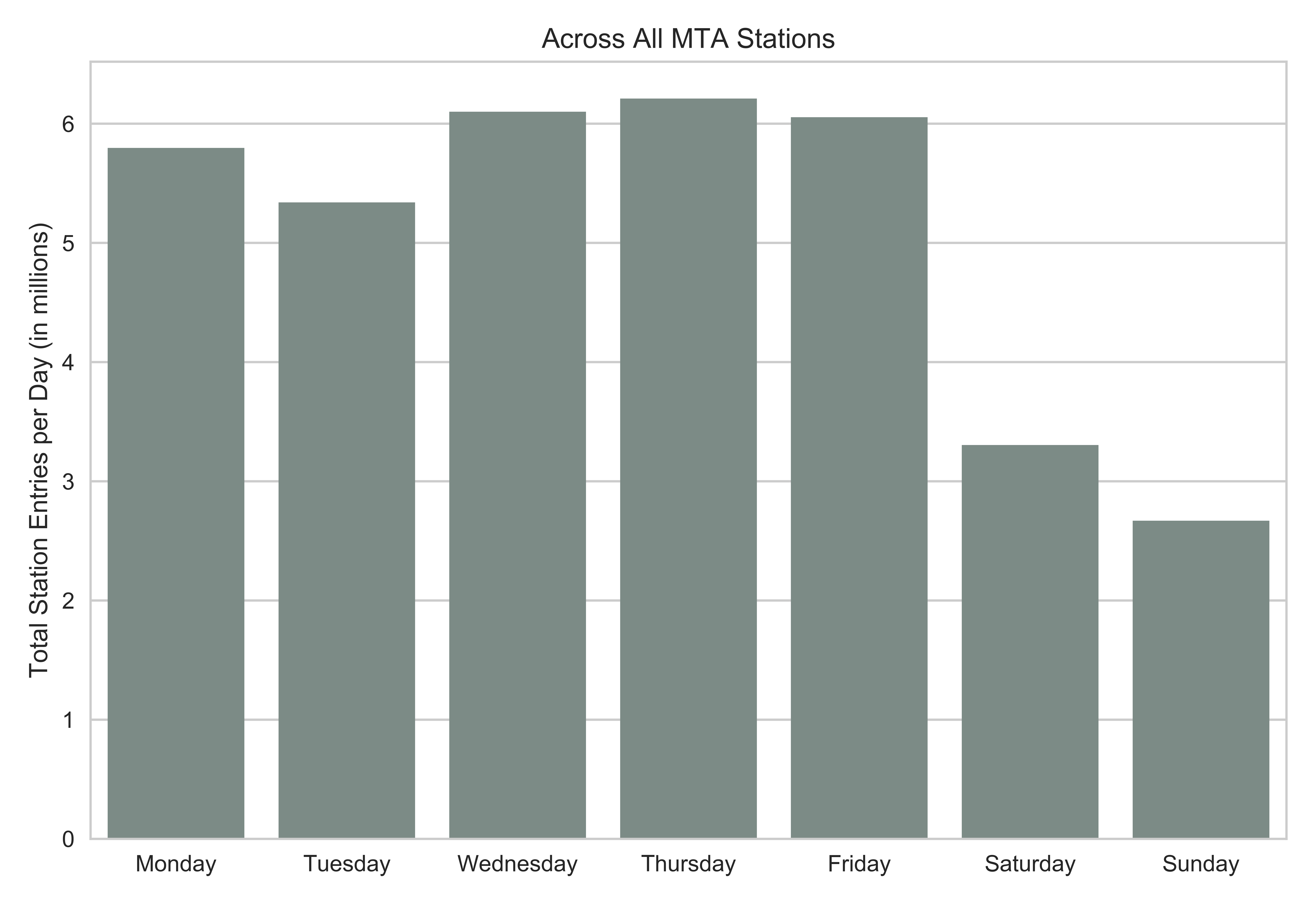
As we expected, stations are the busiest during the week compared to the weekend.

Reflections
This project was a great exercise to practice using Numpy and Pandas to manipulate and explore the data. There were many inconsistencies in how and when the MTA subway data was collected and recorded. I was able to appreciate how data scientists spend a lot of their time cleaning and organizing data.
For example, I quickly realized that there were negative or impossibly large station entries reported when I examined the data. In the data set, the number of entries per turnstile is recorded for each 4-hour period. Assuming that it takes about 3 seconds for each person to pay and pass through a turnstile, I would expect that no more than 4800 people can pass through a turnstile in a 4-hour period. Leaning towards a more liberal threshold, I excluded all records that reported over 5000 entries per turnstile.
I used also Matplotlib and Seaborn to visualize the data. This was my first time using Seaborn, and I enjoyed it. When it comes to plots, I typically prefer a minimalistic style without extraneous colors or elements. Plots created for presentations should be easy to read and convey a single message (which can be challenging). Of course, these plots are different from the ones created during exploratory data analysis, which tend to have many elements and take more time to understand. I found that Seaborn was similar to ggplot2 in R, which I have used many times before, in that it has clean default style but still allows for customization.
There are many more avenues my partner and I could have explored with the MTA subway data, but due to our time constraint (less than a week), we had to be strategic about which questions to tackle. Overall, I thought that Project 1 was a great learning experience. Best of all, I learned to pickle objects using the pickle module to save my clean data frame for future use. This little gem saved me some time when restarting my Jupyter notebook. There were also other python gems I learned along the way that will be useful for future projects.
